
Express Title Services Group, Inc.
Redesigning a small/local business’s website.
My Role
Ux Researcher, UX/ UI Designer
Length of project
2 Weeks
Tools
Figma, FigJam
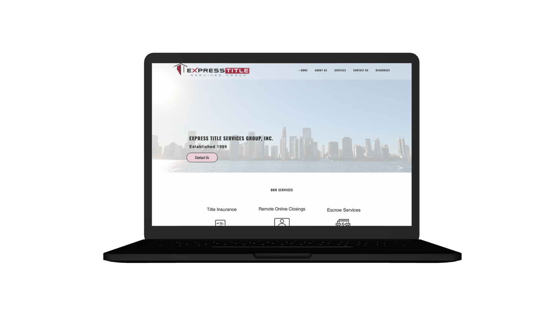
This UX case study explores the process of redesigning the website for Express Title Services Group, Inc., a real estate title company. The objective was to enhance user experience, improve functionality, and ultimately increase user engagement and conversion rates.
Introduction
Our project goal is to gather insights on how individuals perceive and engage with real-estate title company websites, exploring their impact on well- being and daily life to understand their significance in today’s fast-paced world.
Project Goal
Problems
The current website lacks updated information and client testimonials, which negatively impact user satisfaction/user engagement.
To address these challenges and better align the digital presence with their business objectives, we need to redesign the website with a focus improving user experience, increasing conversion rates, and enhancing brand perception.
Solutions
Design Process
1 . Empathize
User Research
Market Analysis
2. Define
User personas
3. Ideate
User Flows
Lo-Fi Sketches
4. Design
Mood Board
Hi-Fi Wireframes
5. Test
User Feedback
Empathize
User Interviews
We started our project by conducting user interviews which enabled us to capture firsthand insights from our targeted audience, guiding us in crafting a more user-centered and impactful presentation of our work.
Style- Moderated In person testing.
Duration- 30 minutes each
Number-5 people interviewed

User Quotes


Key Findings
Following our interviews, we discovered some intriguing key findings:
- 4 out of 5 interviewees expressed a desire to see testimonials on the site.
- All 5 interviewees found the site to be remarkably user-friendly.
- 4 out of 5 interviewees frequently utilize real estate websites.
- All 5 interviewees mentioned that it was effortless to locate services and request quotes.
- All 5 interviewees found the interactive elements to be highly user-friendly.
To dive deeper into users needs, we conducted a competitor analysis which enabled us to identify key differentiators and design strategies used by others, empowering us to create a distinctive and compelling project that effectively showcases our strenghts and captivates our audience’s attention.
Competitor Analysis

Define
User Persona
After conducting our interviews, we decided to create user personas to better understand the preferences and needs of our target audience. This enabled us to tailor our portfolio's content and design to resonate more effectively and showcase our work in a way that is both appealing and relevant to potential viewers.


Ideate
Task Flow
In order to help organize the number of screens we needed to design, we created a user flow for our work which helped us map out the seamless journey that visitors would take through content, ensuring a user-friendly experience that effectively guides them through the design in a logical and engaging manner.
#1 Requesting a quote
#2 Contacting a closer
#3 Finding the Miami Dade Tax Collectors

Lo-Fi Sketches
Prior to creating a prototype for usability testing, we sketched out low-fidelity wireframes with the aim of defining the primary tasks that testers would perform. These screens provide a foundational glimpse into the core structure of the product.


Design and Prototype
High- Fidelity Wire Frames
Finally, we developed a high-fidelity prototype to emulate a lifelike and interactive user experience, offering a tangible portrayal of how viewers would navigate and interact with our project. This enabled us to effectively showcase our design and user interface expertise.
Usability Testing
After the prototype was created, we tested it on 5 users. We made a usability test plan where we outlined research goals, questions we wanted to know the answer from, methodology, information about the participants, and a script with tasks to complete. Mainly we wanted to be sure that the ordering process is smooth without any friction and leads to higher website traffic. This was tested and carried on in-person using Figma's prototype.
The tasks included were requesting a quote, contacting a closer, and finding Miami Dade County’s tax collector. Throughout the tasks, we asked the users to talk through their thought process and speak out when something is unclear or makes them irritated.
After collecting insights from the participants, we made an affinity diagram to organize a large number of ideas into their natural relationships.
Study results
80% of participants (4 out of 5) went through all tasks with no issues. However, 40% of participants (2 out of 5) had difficulties finding the Miami Dade County tax collectors. The issue with the two users who could’t find the tax collector site was that they were unaware it was linked in the resources.
Project Summary
During the project, we managed to evaluate the market research, do a quick user survey, create a set of lo-fi wireframes, build them into hi-fi UI designs, connect them into a prototype, and perform a mini usability study, for a real life client. This was a demanding and time-consuming but very insightful-journey. We learned a lot throughout the whole process but there is a lot of room for improvement and many things to learn.
Thank you for scrolling!
I really appreciate your taking the time to check my case study out! Let me know what you think.